Perfect Draw - Criteria - Visuals [Perfect Draw]

Once we had settled on card and grid-based gameplay, we decided to lean into a ‘toy’ or ‘board game’ kind of aesthetic: simple shapes, low-poly models and colourful cel-shading! We worked to recreate important visuals from the film using these guidelines. Our thoughts were that this would also help us stand out amongst the other (likely much more gruesome) Tremors entries!
We used cel-shading on all 3D elements in order to emphasise the toy-like aspect of the game and to improve readability.

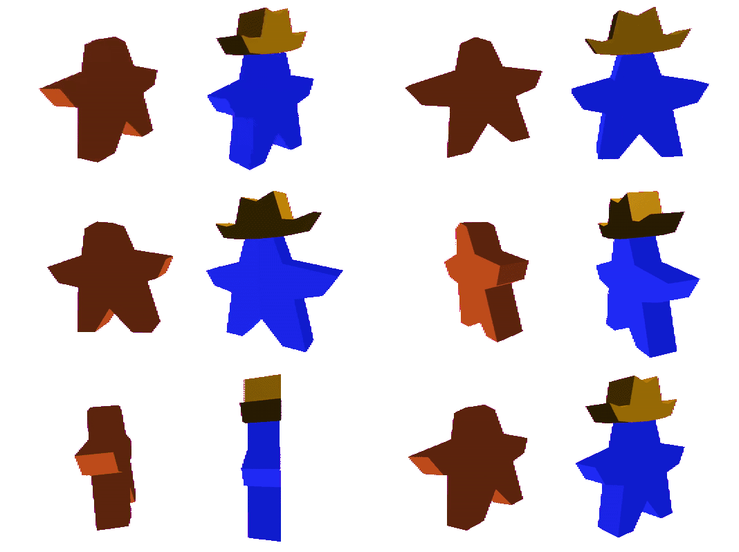
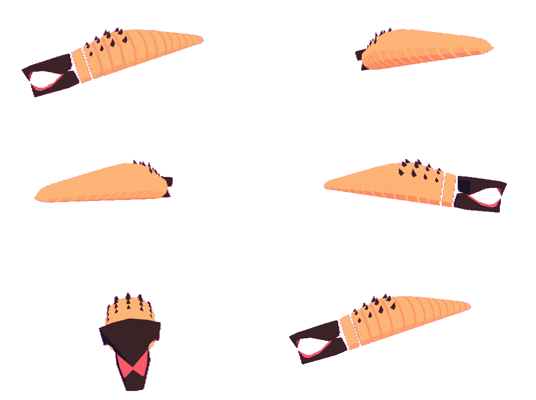
For characters and creatures we took inspiration from traditional board game tokens and wooden toys. The population of Perfection are represented by ‘meeple’ tokens, while the Graboids are based on segmented wooden snake toys. Our “animations” for these are also minimalist, often just squashing and stretching, but they really fit the aesthetic!

For buildings it was important that they remain recognisable and unique when condensed into a 1x1 grid tile, so we used low-poly models and bright, blocky textures to really bring out the iconic elements of each location. Vehicles were given a similar treatment; it wouldn’t be Tremors without Val and Earl’s pickup truck!
For 2D elements we went with a flat and minimalistic look to contrast with the 3D and to keep information clean and easy to read.
All playing cards share a similar layout for consistency, but each type features a distinct design and border colour. This helps for readability, as the player can tell what cards they have in their hand at a glance.

Popups above objects have clean and simple iconography so a player can quickly check information such as a building’s condition, or a meeple’s weaponry.
We loved the look of Perfection’s town sign and decided to use it as our population counter! Can you keep Perfection’s population from dropping to zero?
The iconic town sign is also your first sight on the main menu, which is another area we really focused on polishing to perfection ;) Everything is as dynamic as possible here; with the camera zooming around the scene, menus swooshing from side to side, and buttons giving lots of feedback. Even Val & Earl’s truck which you ride into town on when you login! The menu music is lovely and chill, plus its diegetic nature really emphasises the feel of moving around the town and exploring the different options! We definitely ended up just siting and vibing with the menu more than once..
Overall we hope its obvious how important the aesthetics and game feel were to us on this project!